
Visual Direction • AI VFX • Interactive Web (Seoul)
2025. 05
2025. 05
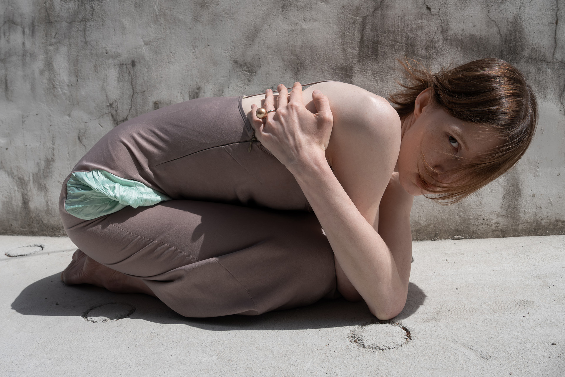
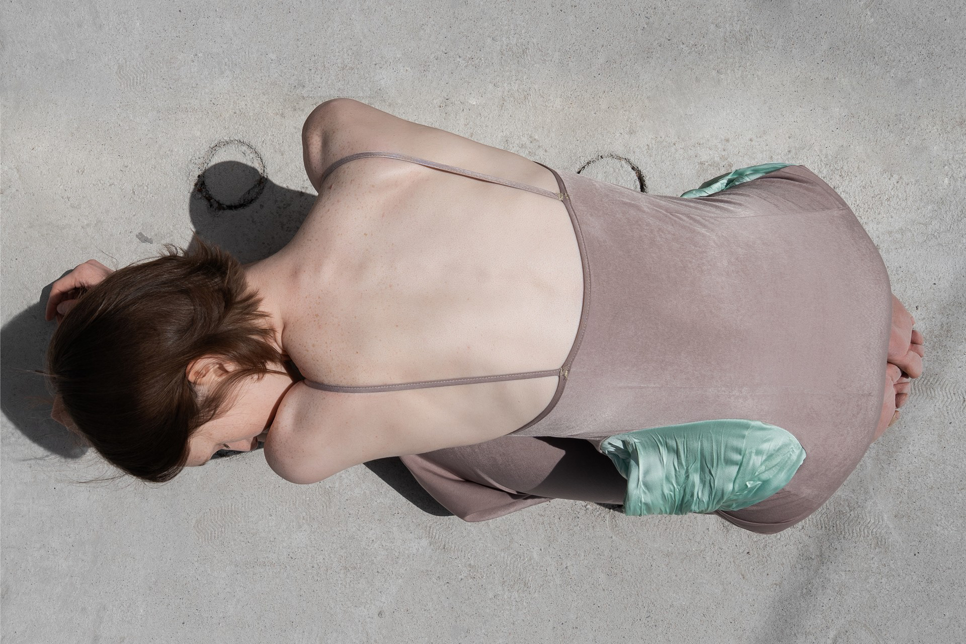
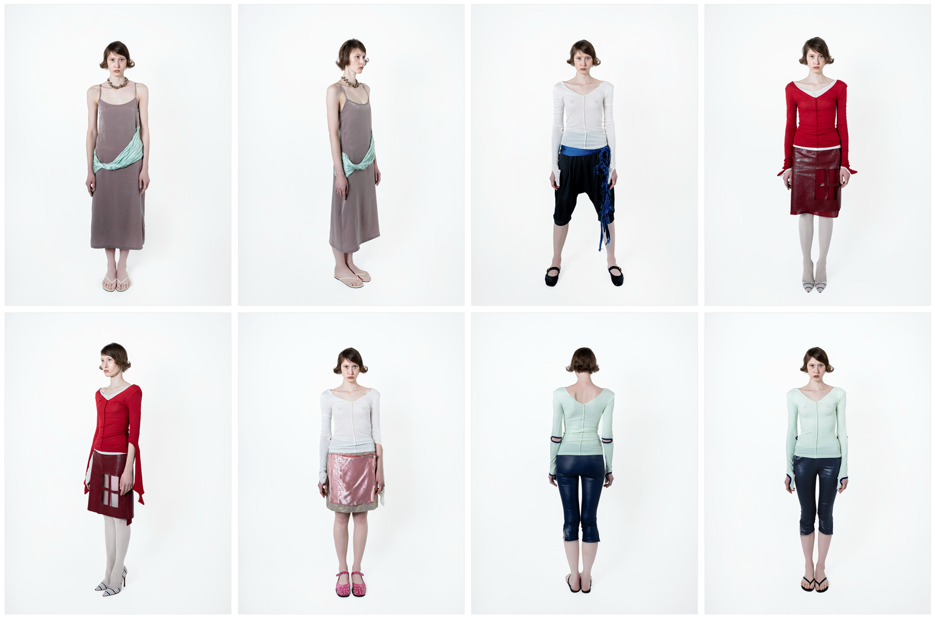
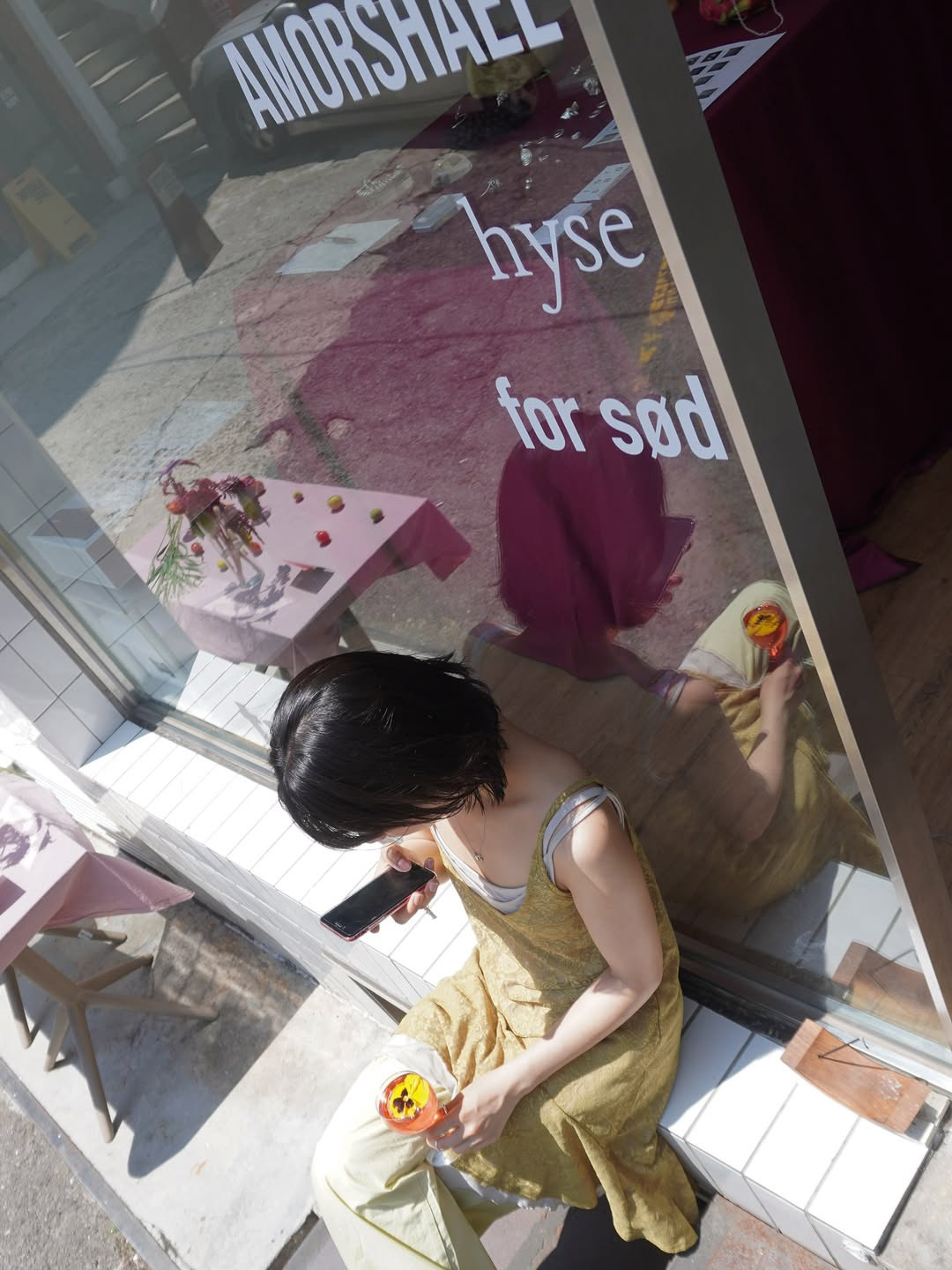
PUNCTUM TEST 004 — Նռան գույնը (The Color of Pomegranate)
PUNCTUM TEST 004 is a small-batch fashion collection centered on the act of opening — the irreversible threshold between before and after. Inspired by the film The Colour of Pomegranates, the collection draws its visual language from the pomegranate: a fruit that, once broken, cannot be made whole again. Each garment — the 'Book on Skirt', the 'Window Skirt', and the 'Vessel Dress' — was conceived as a physical metaphor for that moment of crossing. This also directly links to the concept of 'punctum' itself: a singular, piercing moment of perception from which one can never return to who they were before.
The project encompassed the full visual identity of the collection's release. Creative and visual direction shaped the lookbook shoot across various locations in Seoul, defining the color palette, conceptual staging, and editorial tone. Alongside the still photography, AI-generated VFX video was crafted as a campaign asset — sequences of a book splaying open, seeds scattering, and figures moving through the collection's visual world — extending the narrative into motion.
For the main website (punctumtest.info), an interactive landing page was custom-built and embedded into the brand's site.
Designed around Armenian — the original language of the film — the page features thematic typography that triggers AI-generated videos upon hovering over specific characters, seamlessly leading users to the corresponding products upon clicking.
Designed around Armenian — the original language of the film — the page features thematic typography that triggers AI-generated videos upon hovering over specific characters, seamlessly leading users to the corresponding products upon clicking.
The Armenian title — Նռան գույնը — functions not as mere decoration but as the conceptual spine of the collection:
a language chosen for its distance, its weight, and the specific color it names.
a language chosen for its distance, its weight, and the specific color it names.
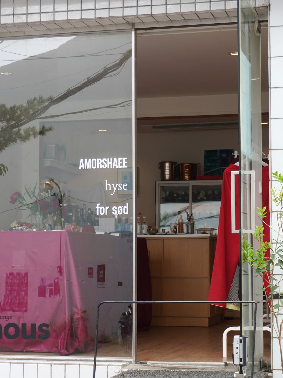
art team For Sød (Seoul)
2024.12 ㅡ present
2024.12 ㅡ present
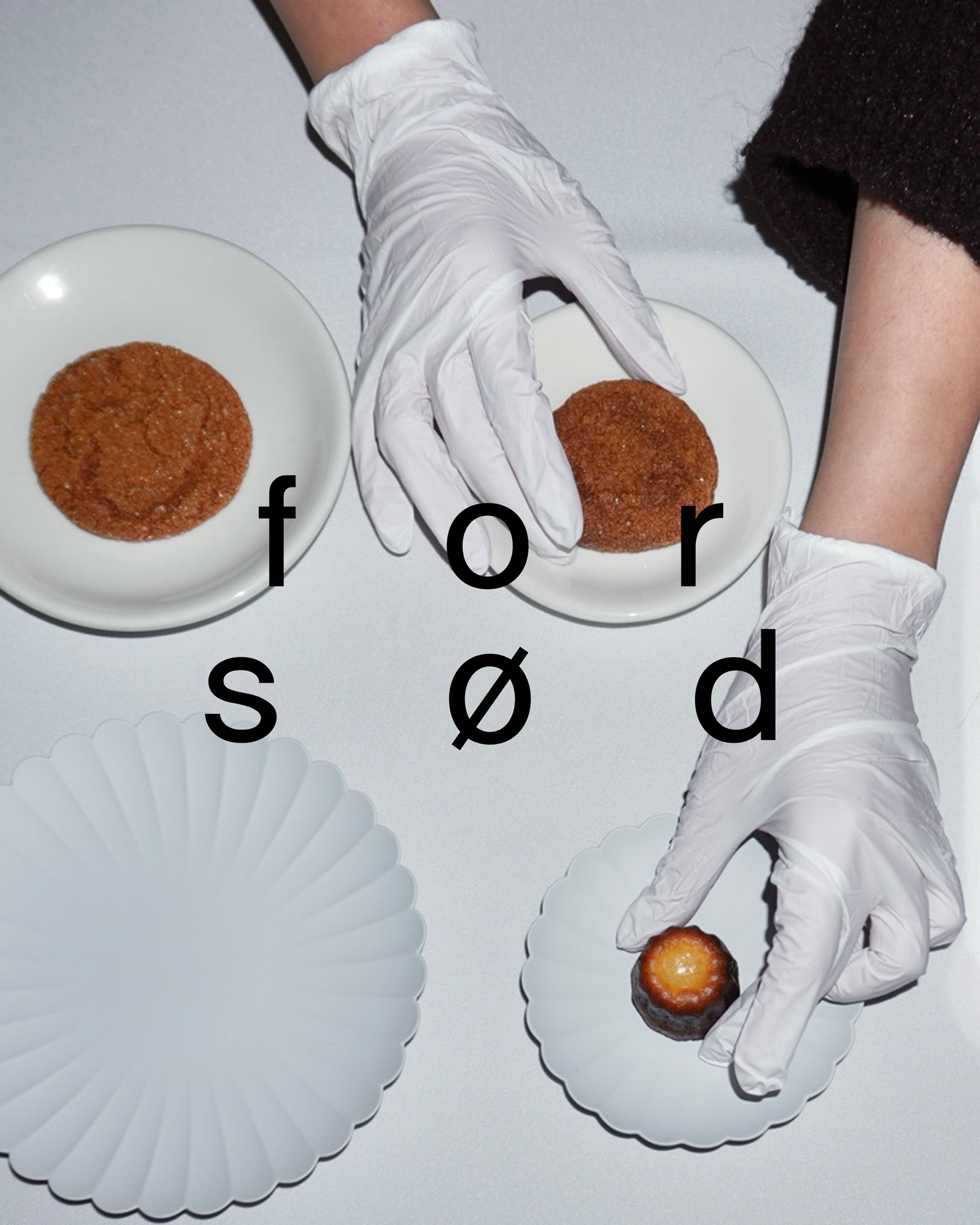
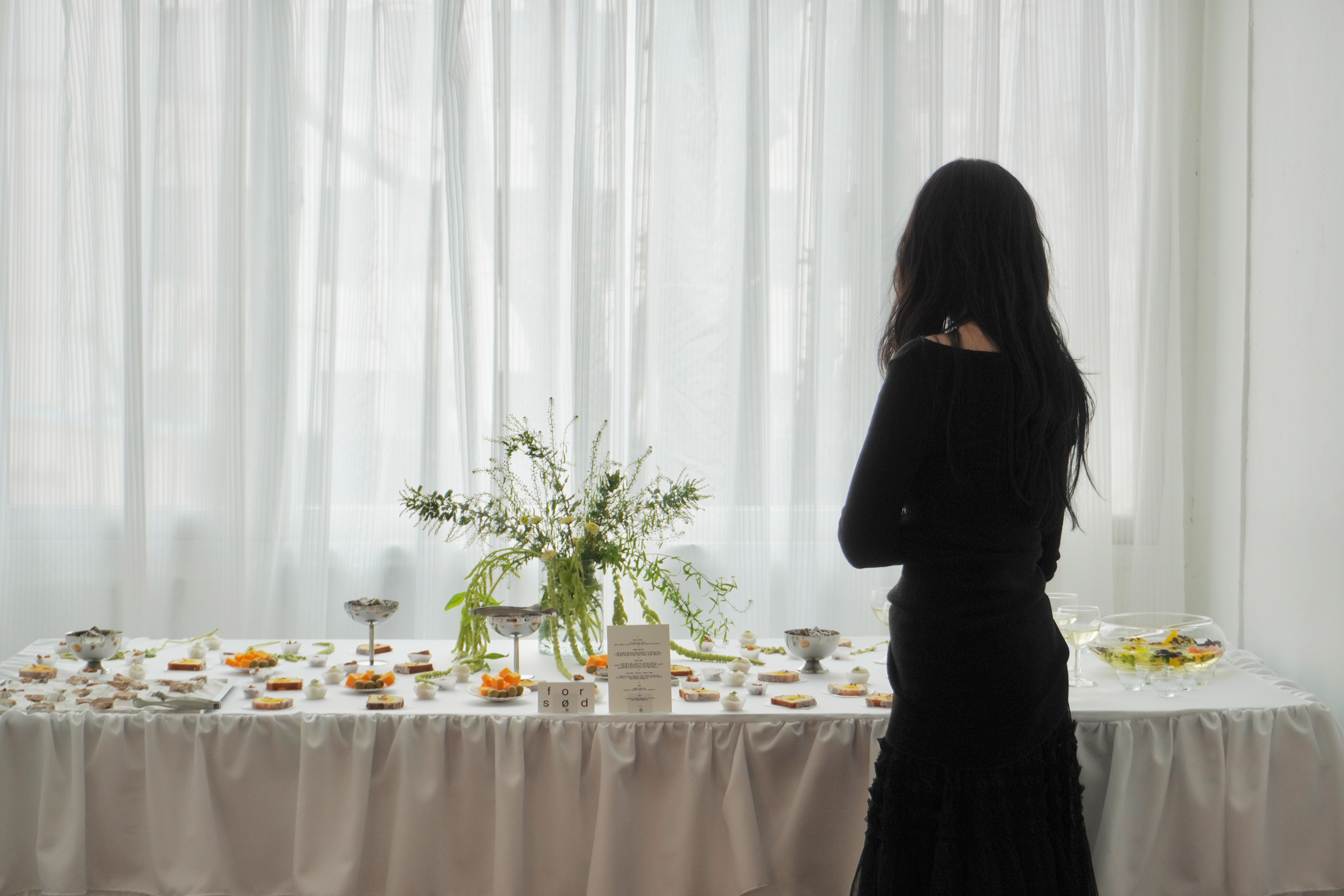

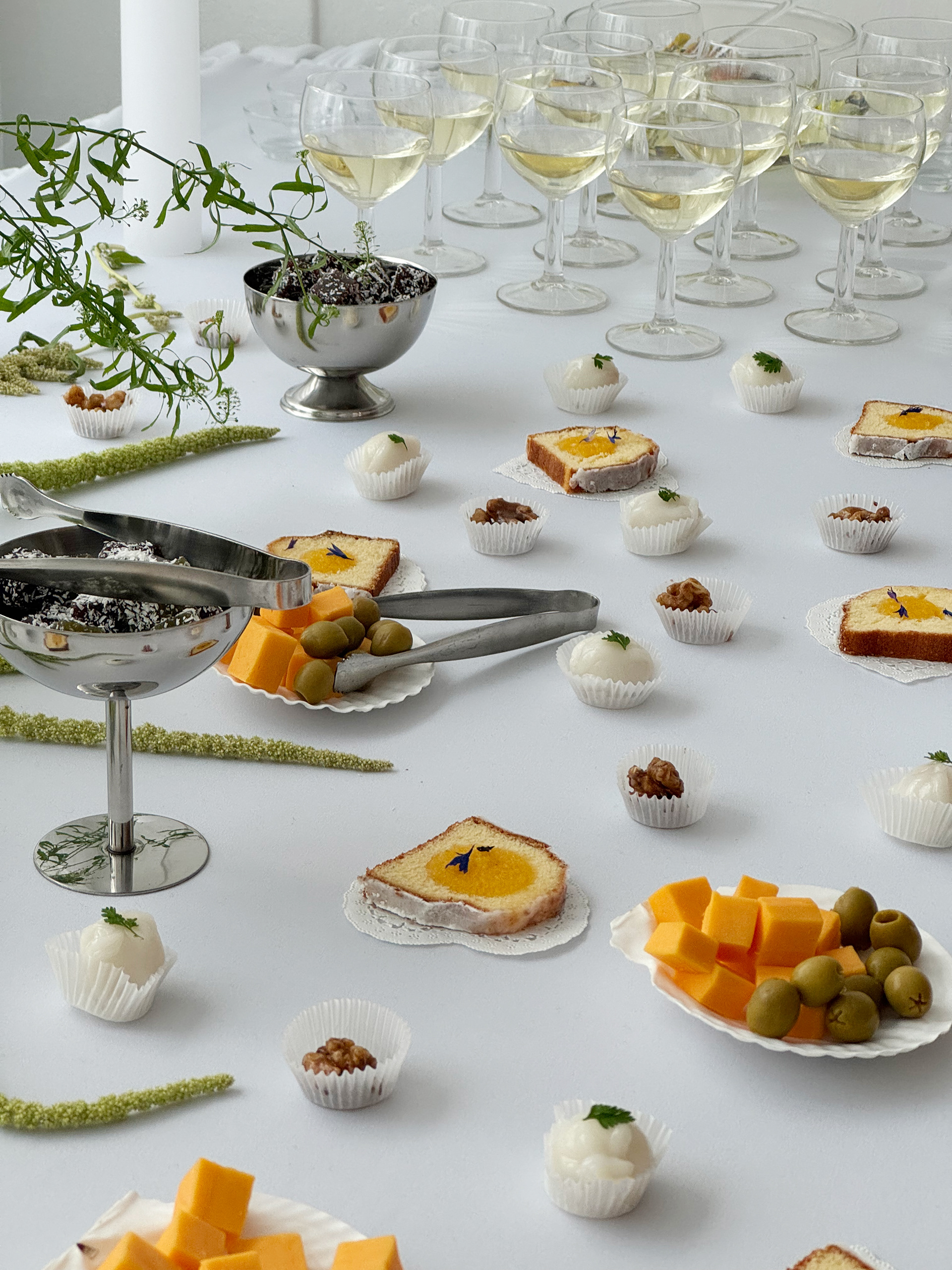
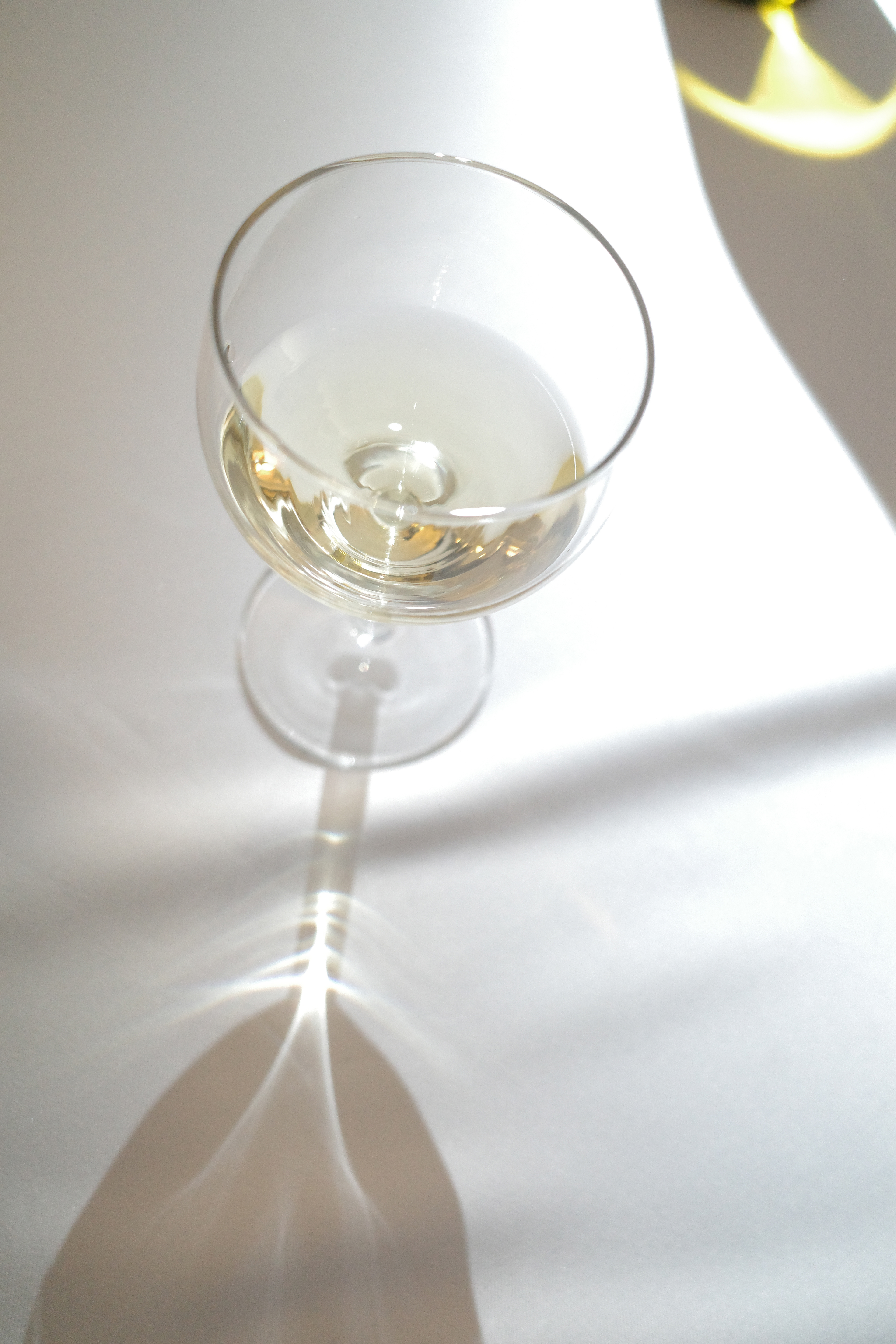
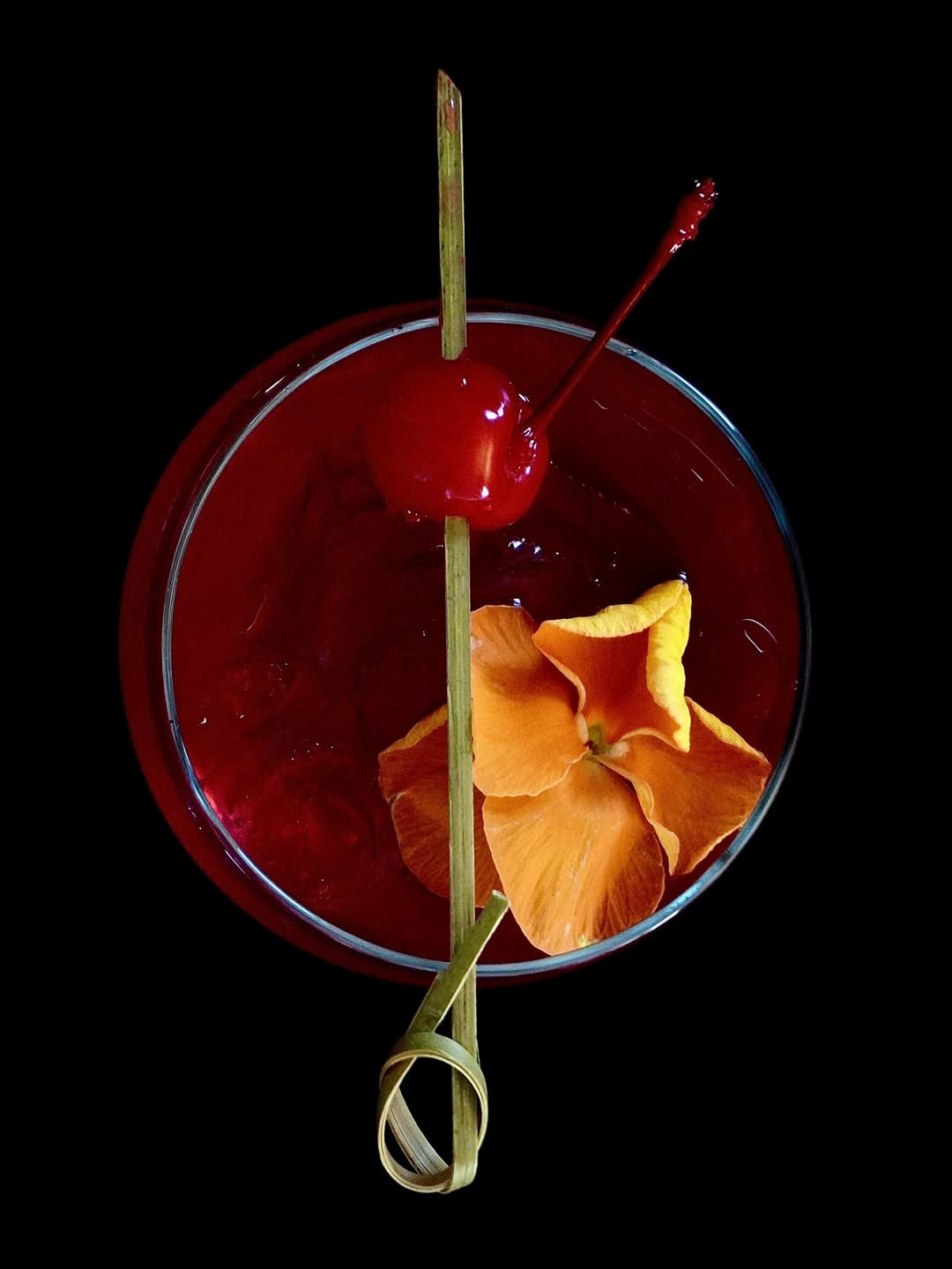
"for sød" derives from the Danish phrase for "too sweet." Our team aims to intentionally create "sweet moments" within the ordinary flow of time that might otherwise pass unnoticed. We focus on providing event-based visual experiences, pairing diverse desserts and beverages with curated aesthetics tailored to specific moments.
For our first offline project, we directed and executed an immersive visual experience centered around a gathering party.
To capture the essence of the winter season, we produced a selection of handcrafted desserts, including Stollen Financiers, Pound Cakes, and Yanggaeng,
which were thoughtfully paired with Flower Tea and White Wine to enhance the overall sensory atmosphere.
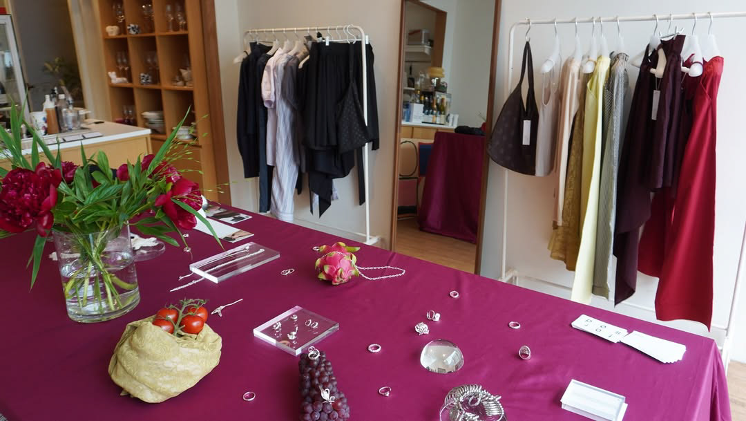
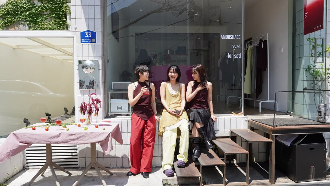
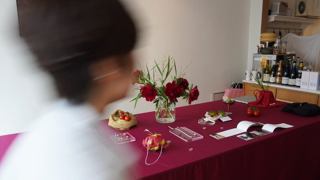
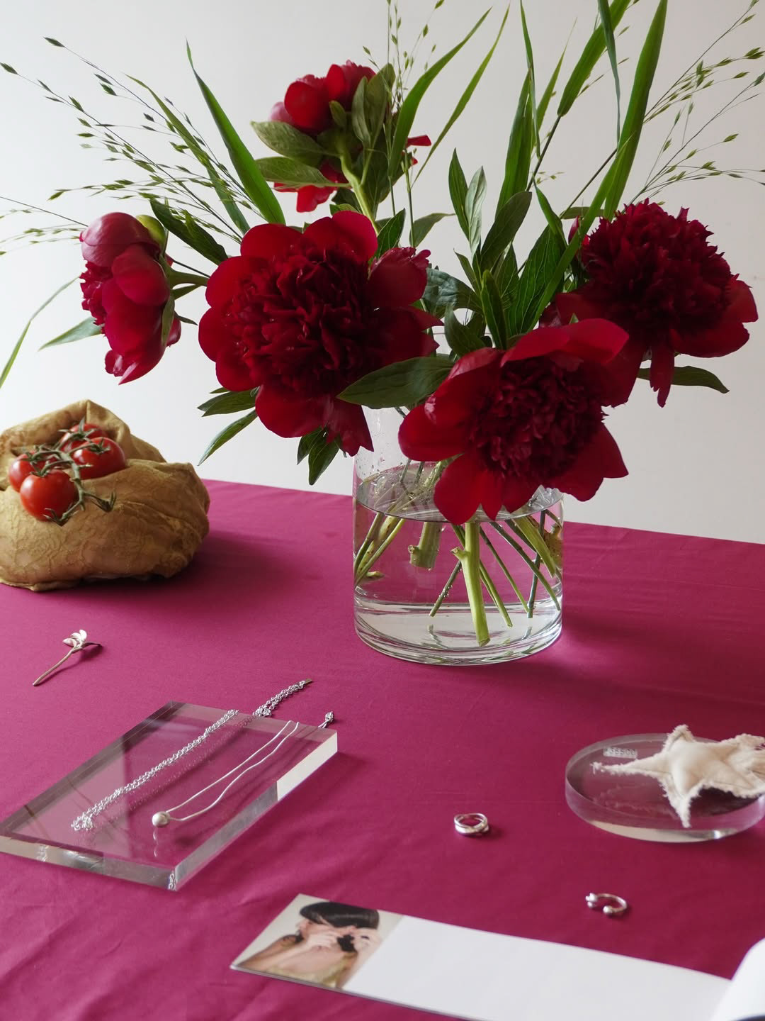
Pop-up Store Planning & Production (Seoul)
2025.06
2025.06
I directed and managed a two-day pop-up store in Hannam-dong (Seoul) in collaboration with two fashion and jewelry brands, serving as the Lead VMD and Beverage curator.
To unify the distinct identities of the three participating brands, I established the overarching theme "seep into — ivy — blush."
This concept served as the creative foundation for the entire project, ensuring a cohesive brand experience.
This concept served as the creative foundation for the entire project, ensuring a cohesive brand experience.
As part of the project, I developed a custom cocktail menu that translated the visual theme into a sensory experience for visitors.
Furthermore, I spearheaded a collaboration with the handmade brand 'MINIKEY' to produce and sell a limited-edition collection of bag charm accessories,
successfully expanding the brand's touch points through exclusive merchandise
Furthermore, I spearheaded a collaboration with the handmade brand 'MINIKEY' to produce and sell a limited-edition collection of bag charm accessories,
successfully expanding the brand's touch points through exclusive merchandise
Private Tasting Event Planning & Creative Direction (Seoul)
2025.05
2025.05
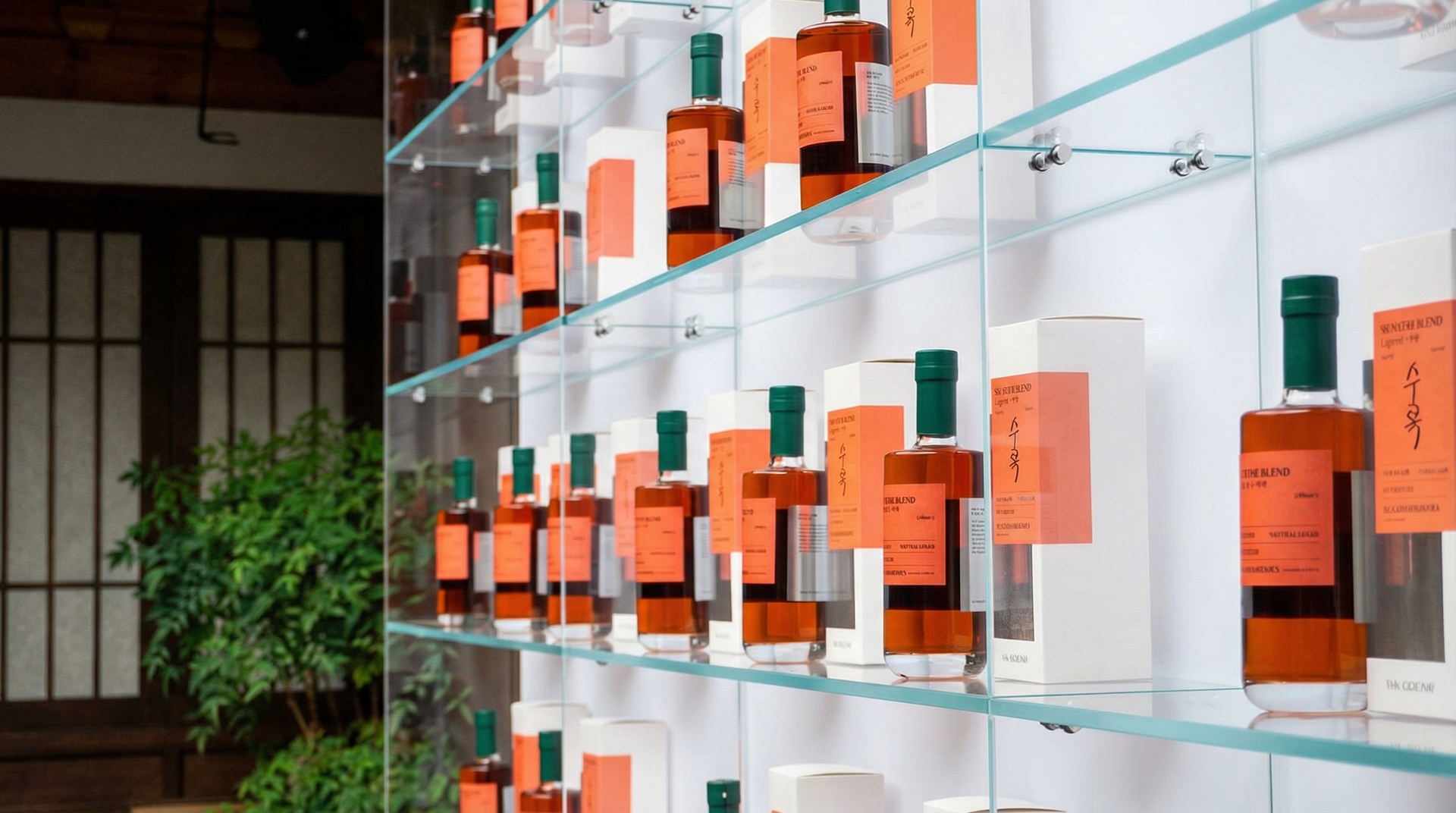
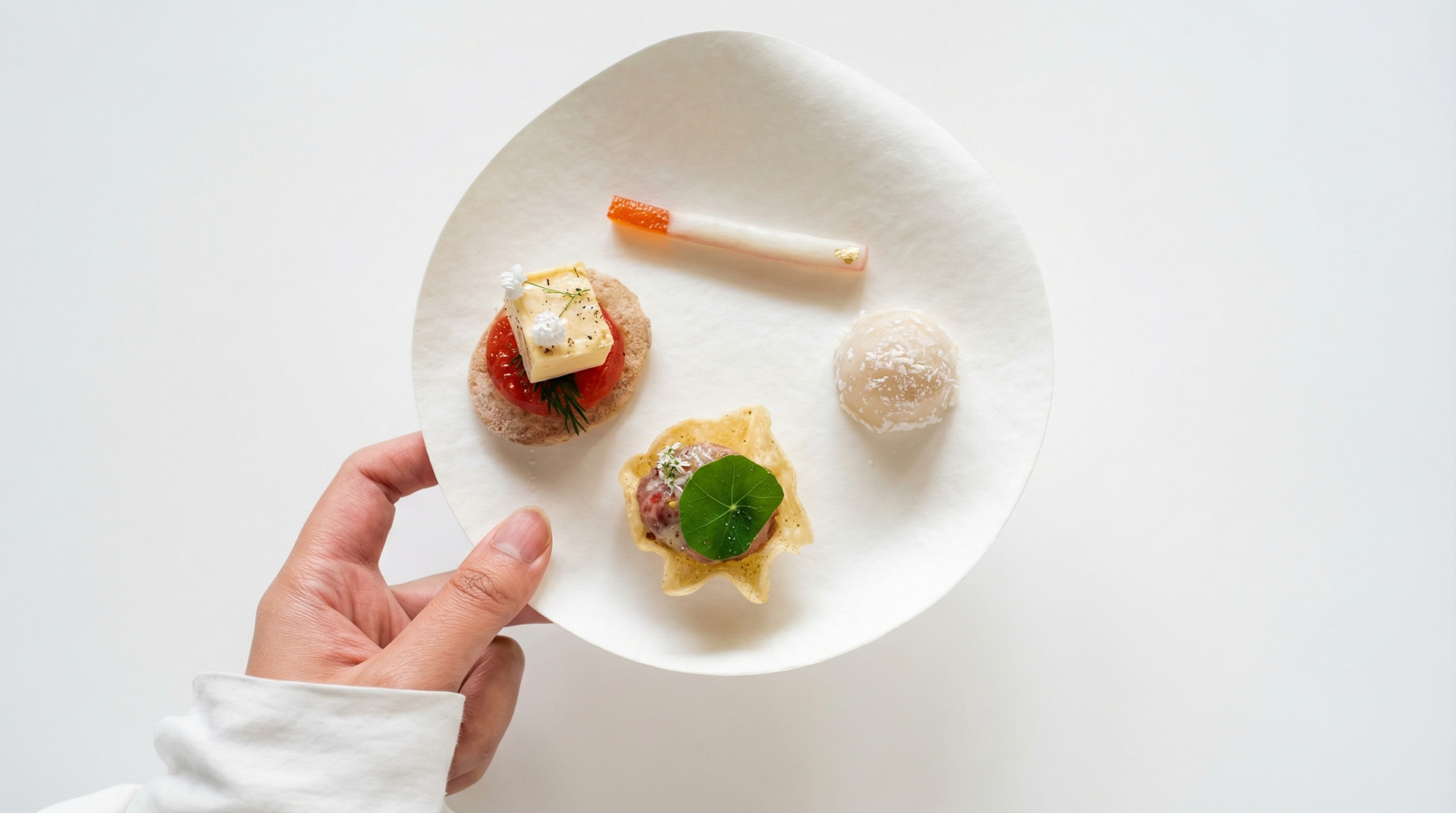
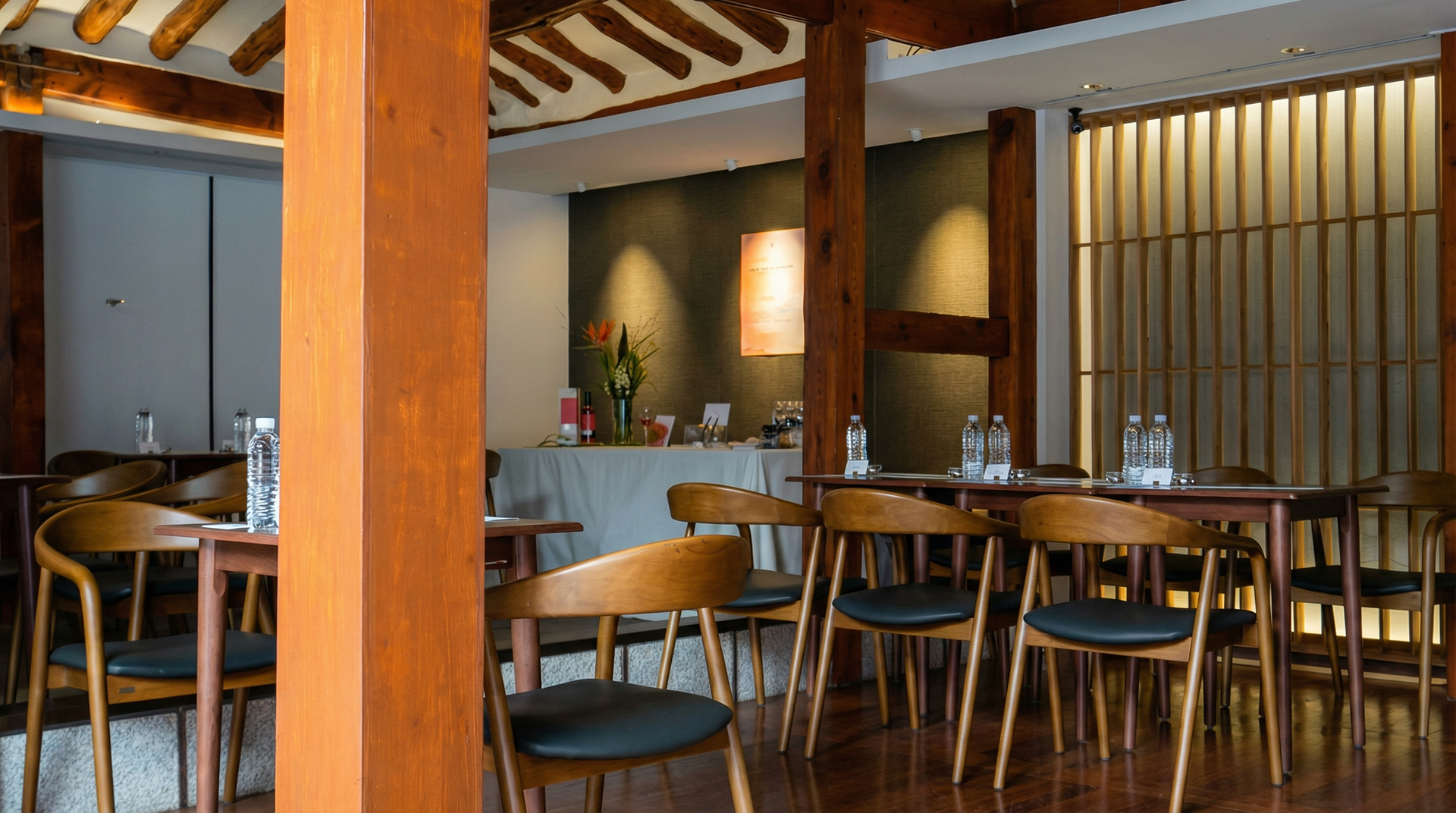
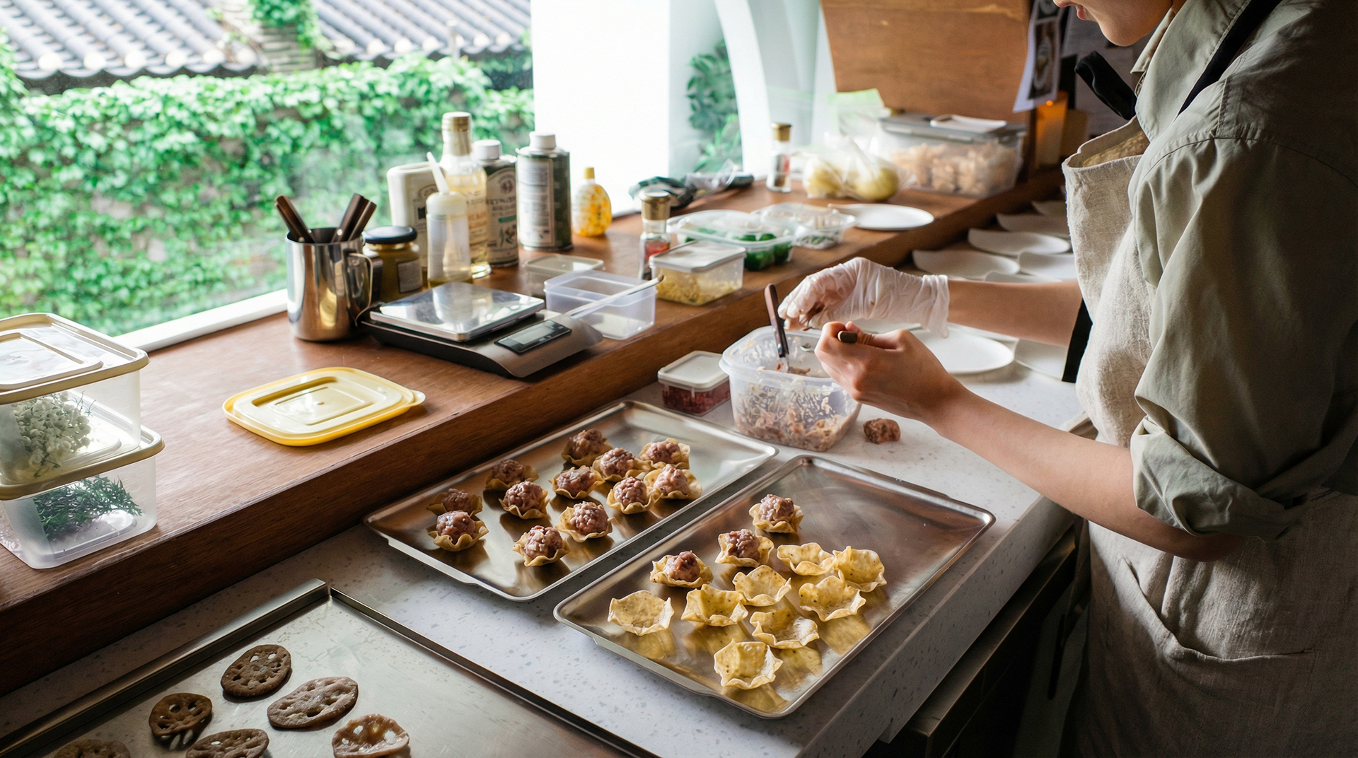
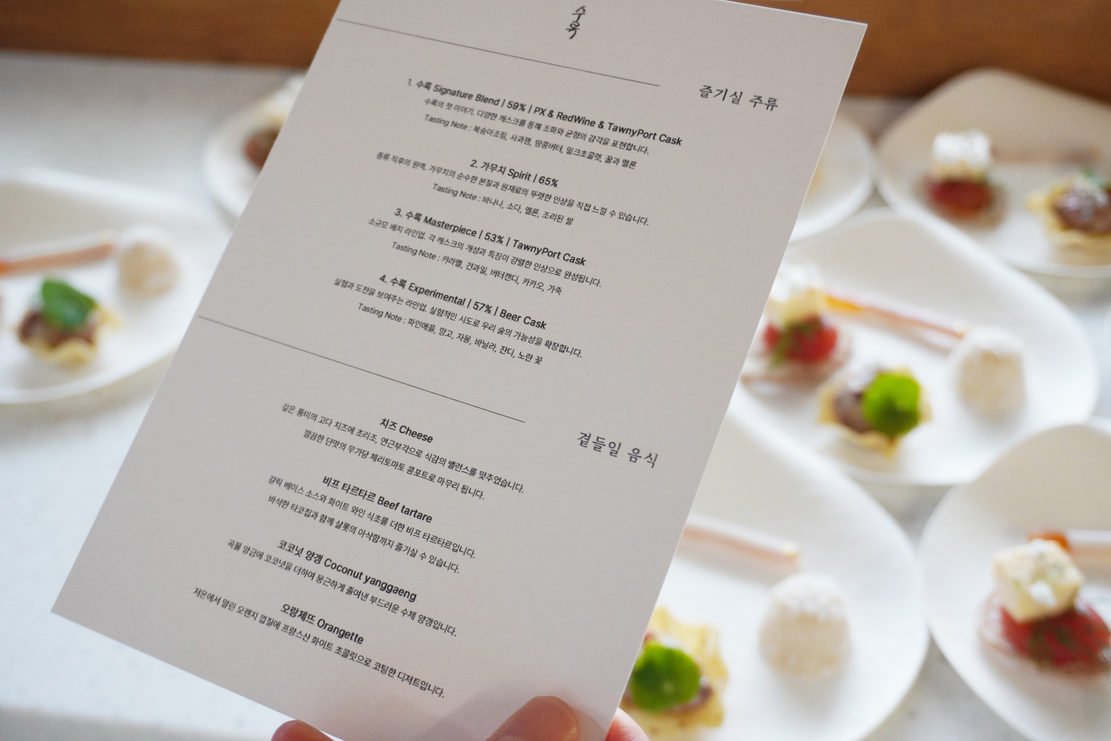
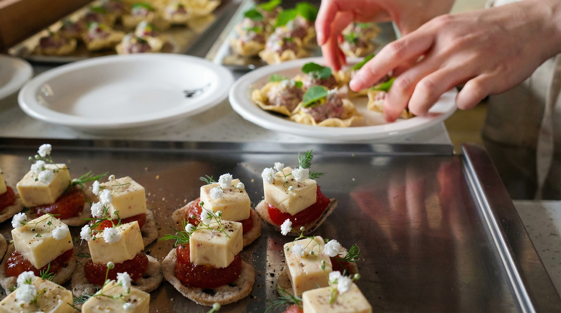
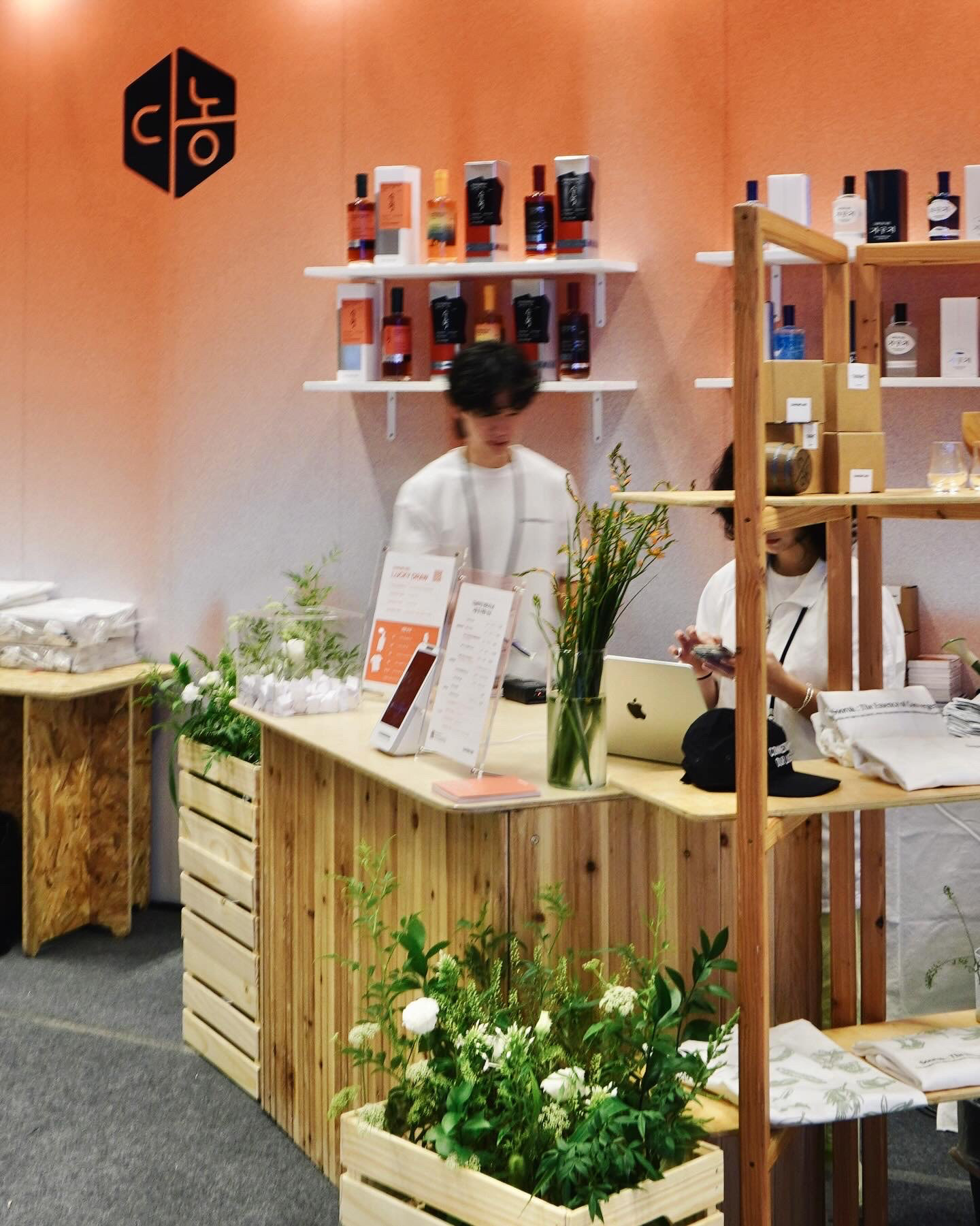
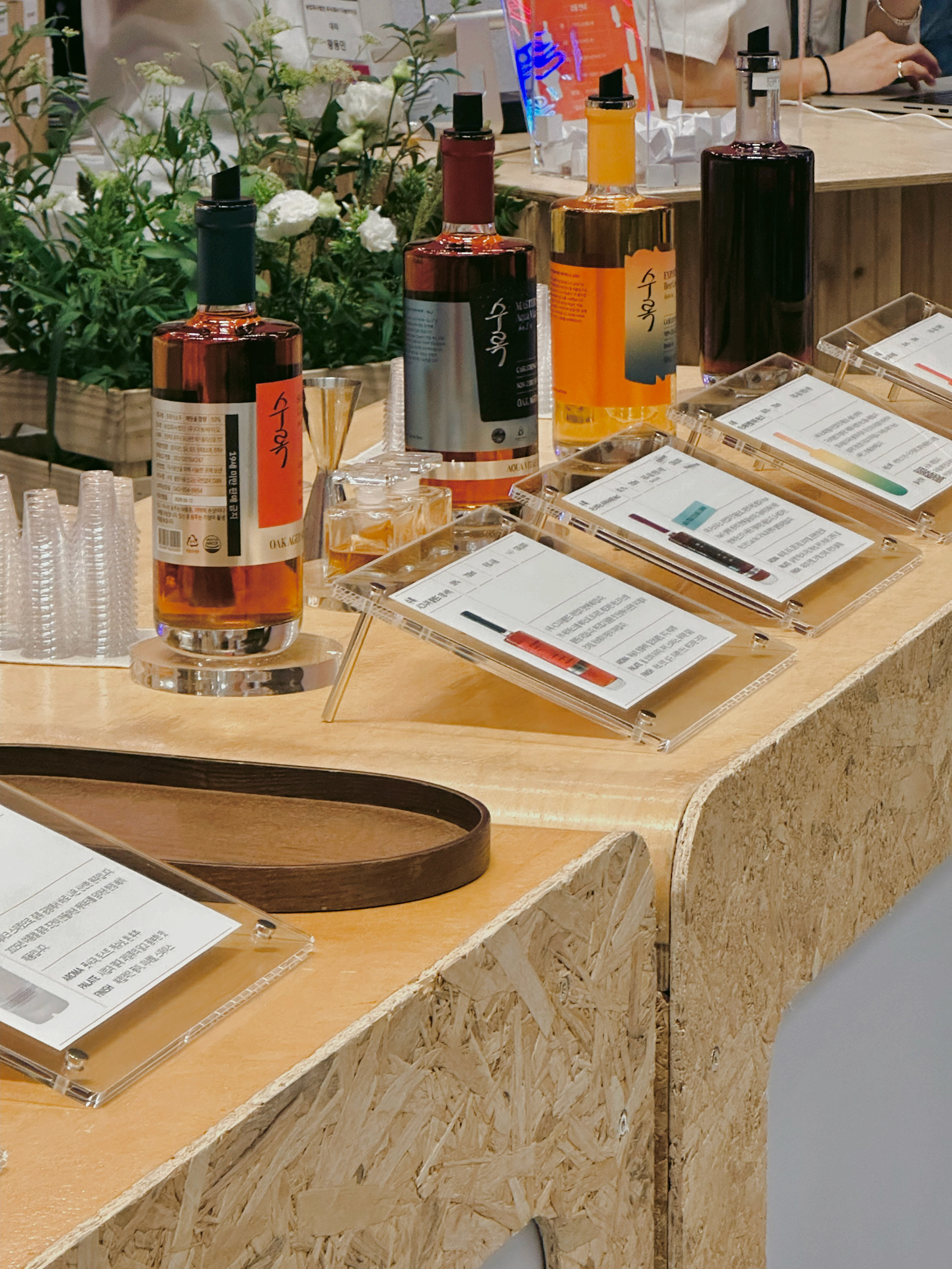
I directed the spatial design and brand experience for the private tasting event of 'Soorok,' a new oak-aged spirit lineup by Danongbio, a distillery based in Chungju.
The event took place in Bukchon, Seoul, where I managed the following creative sectors:
The event took place in Bukchon, Seoul, where I managed the following creative sectors:
- VMD & Spatial Direction: Orchestrated the visual merchandising and spatial atmosphere to reflect the premium identity of the new product line.
- Catering & Food Pairing: Concepted and executed a curated catering menu specifically designed to pair with the tasting spirits.
- Graphic Design: Designed promotional materials, including event posters and tasting cards.
- Merchandise Packaging: Developed the packaging design for exclusive event merchandise.
2025 Seoul Bar & Spirit Show: Creative Direction (Seoul)
2025.07
2025.07
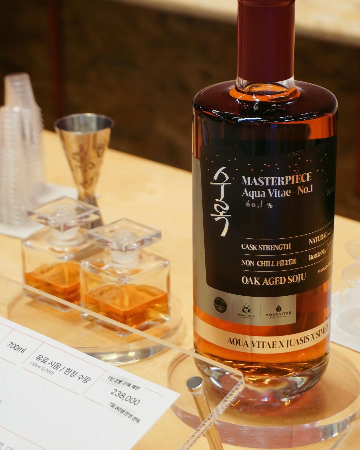
I directed the spatial VMD and limited-edition merchandise production for Danongbio at the 2025 Seoul Bar & Spirit Show,
tailoring the strategy to the specific nature of a high-traffic liquor exhibition.
- Visual Identity & Key Color Setting: Established a cohesive visual atmosphere by implementing the key colors of the newly launched liquor line throughout the booth setting.
- Zoning & Spatial Layout: Optimized the booth flow by strategically separating the Tasting Zone and Sales Zone to enhance visitor experience and operational efficiency.
Copyright © 2025 SUGYEONG BAE. All rights reserved.